Gap Golf Mini Golf
Studio: Sophia Ramsey Design
Building this logo for the business “Gap Golf” came with a unique set of users to design for. The town where the business is located has a rich Blue Ridge Mountain history, and a wide age gap between the elderly who have kept it and the rising generations that are revitalizing it. This logo needed to appeal to both users by being trendy, yet legible and timeless while also hinting at the vibrant history of this little town located in the gap between two mountain passes.

The Executive Edge Leadership Catapult Study
Studio: Sophia Ramsey Design
This logo was created for a leadership course designed by a long-term freelance client, The Executive Edge. The icon to the right of the course name is intended to mimic the look of a power button, and when joined with the forward movement arrow it is intended to symbolize the forward momentum and power up this program will provide for Executive Edge Clients and their businesses.

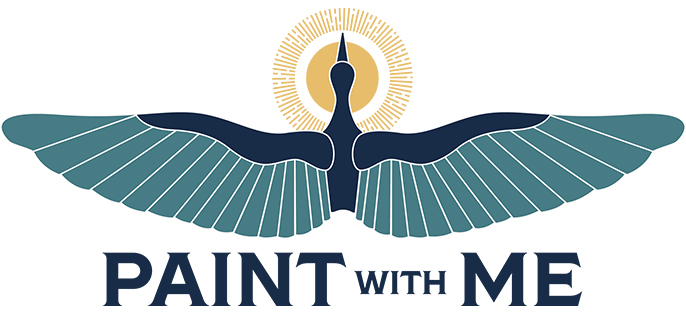
Paint With Me Studio
Studio: Sophia Ramsey Design
The Paint with Me logo was created for a mixed media artist opening a painting studio for locals in a small beach town in North Carolina. The painter’s last name is “Crane”, so she asked that I use a crane symbol in the logo to not only represent her name, but also emulate the symbolism of the ideals that cranes represent and which she wanted to embody in her business—beauty, harmony, and grace. The halo-esque sun behind the crane’s head has a dual meaning, representing the sunshine in the beach town, but also as a subtle nod to the artist’s faith, which was very important to her philosophy as a painter.
Union Central, Student Game Room
Studio: William & Mary
This logo was created as part of the revitalization process for the student hub at The College of William & Mary within The Sadler Center. The Sadler Center provided a location in the center of campus for students to gather and connect, pick up their mail, play games and relax, and study. The central area for students to gather was lacking a name and branding, so I was tasked with breathing some life into the space. I started with the logo, keeping with the branding and rich history of the university. I employed the use of the school colors green and gold, retro pool ball design, and the new name “Union Central” to (which was the student center’s original name prior to being changed to “The Sadler Center” in the late ‘80s).

One Ten Plaza
Studio: CBRE

The Four Seasons Country Store & Restaurant
Studio: Sophia Ramsey Design

SSH Research Summit
Studio: GRAPHEK

FNIDCR Logo
Studio: GRAPHEK
National Orchestra Festival Logo
Studio: GRAPHEK
